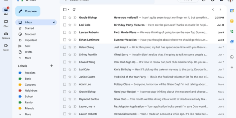
Google has finally rolled out the red carpet on its widely anticipated new Gmail design, that focuses on collaboration and chat. In their blog, the company stated that their new design was made to combine Google’s “material design 3” strategy and more Google Workspaces features into the design of the company’s consumer platform.
What’s changed in Gmail?
Gmail has evolved a few times since it was first launched about 18 years ago. These changes appear to have focused mainly on the design elements, at least for the moment. The company has finally evolved Gmail into something that looks more modern and now allows for better customization.
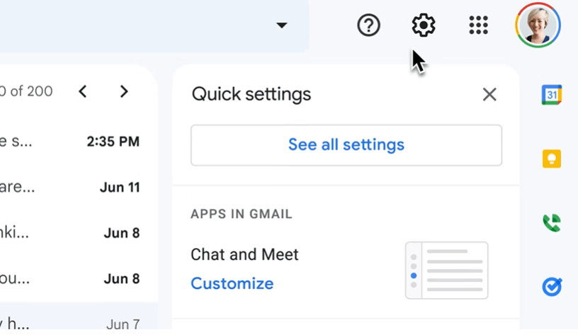
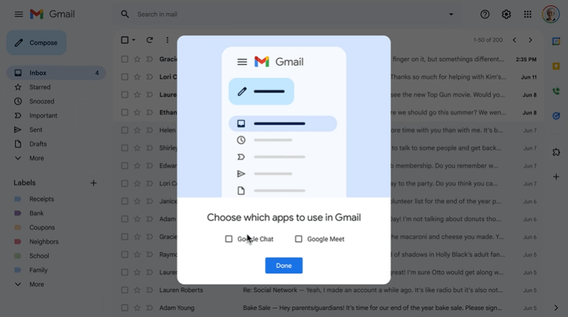
For example, Google’s new layout (if you enable it) allows you to choose the Google communication app that you want to use for default communication (i.e. Google Meet or Google Chat).
More powerful search capabilities
In line with the design changes, Google has introduced more powerful search capabilities like “search chips” to speed up looking for emails. When using the new “search chips,” contextual and relevant suggestions are made to refine and narrow your search in your mailbox. Google says this is just the start of improvements to the platform with additional capabilities like better emojis, better tablet-based email, and improved accessibility features this year.
You can revert back for now, if you want the old design
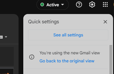
While most will likely be sticking with the new design on the platform, the good news is that if you don’t want it – you can revert back for now. Under the settings gear on the top right-hand side of the Gmail interface, users can click “go back to original view” for the time being. This revert function is likely to stick around for a little while until most users are comfortable with the new view, but Google hasn’t given us a deadline when you’ll have to make a move.









Comments